How to create a design system that is simple, scalable and cohesive across various brand experiences and platforms?

Achieving Cohesion and Scalability

  • App deisgns for health, mental health, and telemedicine, including Livongo, MyStrength, Teladoc, and others.

    Assessment

    What happens in a company merger when three brands come together to offer an integrated, whole-person care app experience?

  • brand migration and evolution

    Foundation

    Merging companies into one modernized brand illustrates how essential a global design system is for both internal teams’ efficiency and alignment and to build familiarity and trust for end users

  • Design system benefits

    Extension

    End-to-end user journeys that deliver continuity and cohesion while also building user’s trust in the brand(s) starts with a mature, high-quality design system

A design system remains a design “style guide” unless it is discussed, planned and built with engineering partnership. It’s essential to build on the foundation by developing components across platforms and for various contexts. This will result in delivering a system of cohesion, continuity, consistency and extensibility.

What are a few effective tools for building a design system?

1. Figma: which excels in creating, maintaining, and updating design systems for components, styles, variables, and libraries, and makes it easy for xfn teams to collaborate in real time and test in UX/UI design contexts

2. ZeroHeight: for design documentation and guidelines. It integrates well with Figma and helps create a single source of truth for both designers and developers

3. Storybook: serves as an interactive UI component workshop for developers. It allows dev teams to build, test, and document UI components in isolation, ensuring consistency across a design system. Good to have your eng team weigh in on this, as not all are fans of Storybook

4. Figjam: integrated into Figma. Ideal for early-stage ideation, voting on component structures, and gathering team feedback and creating alignment
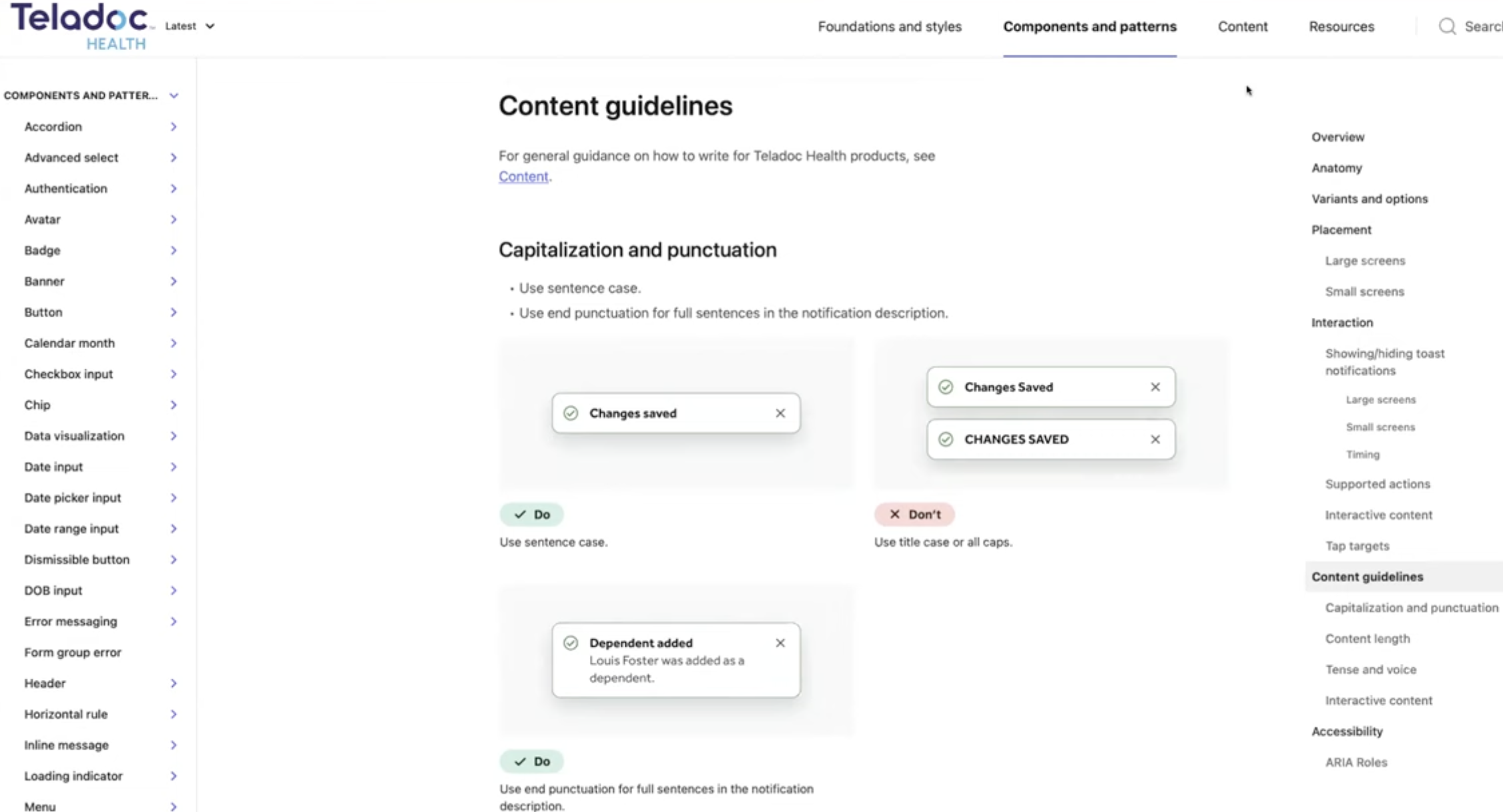
Screenshot of a webpage titled 'Content guidelines' from Teladoc Health, detailing writing tips on capitalization, punctuation, and content length, with navigation menus on the left and right sides.
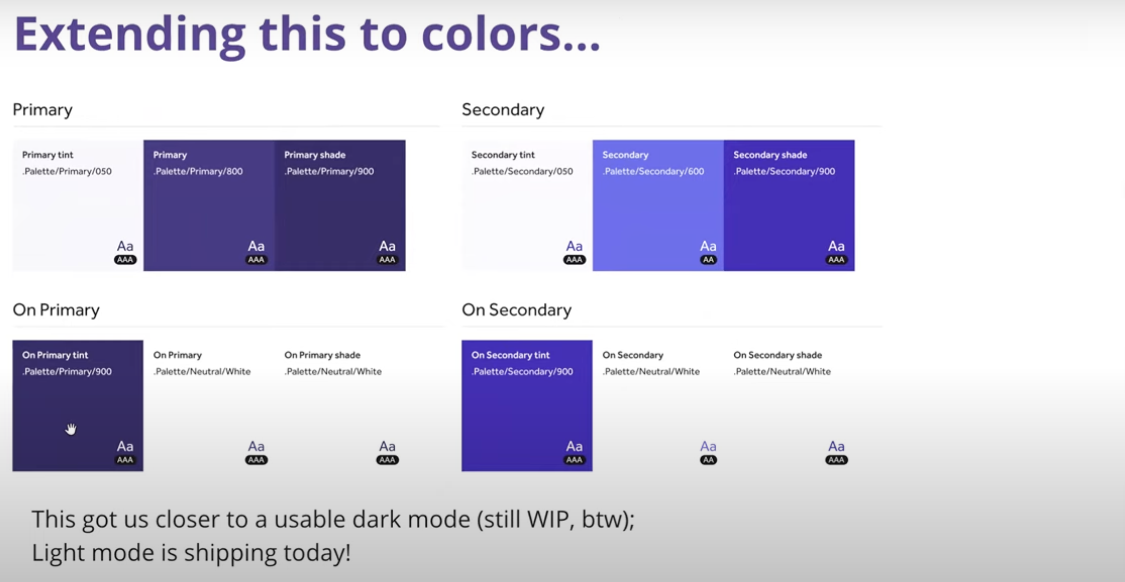
A color chart showing how to extend primary and secondary colors to different shades and tints, including code numbers for each color.
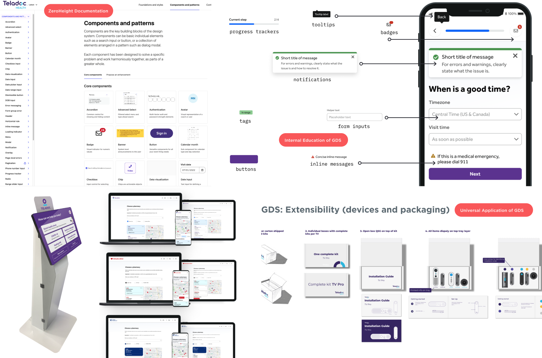
A digital display and product packaging for Teladoc Health's extensibility platform, showcasing various components, patterns, and device integrations for healthcare application development.
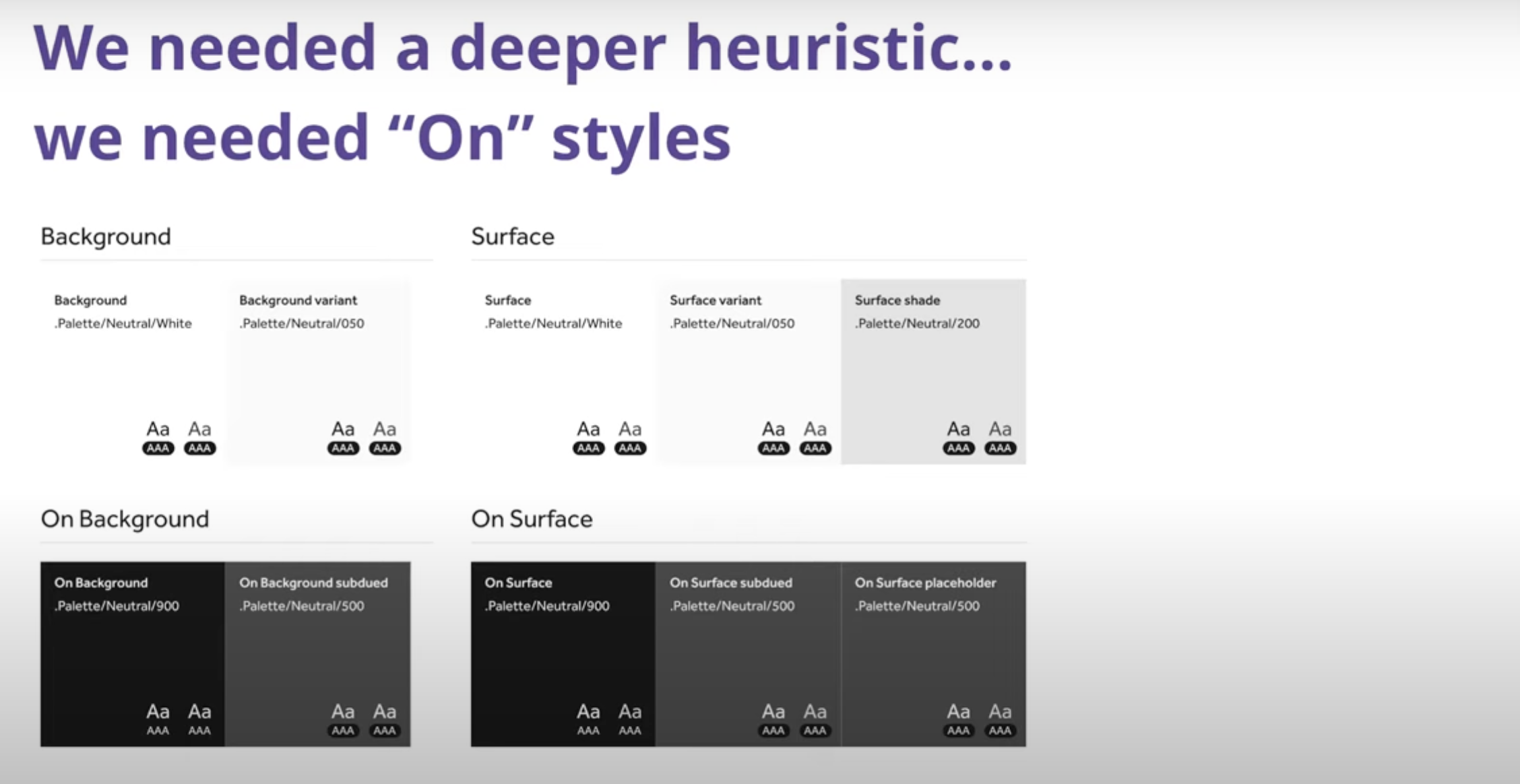
Slide titled 'We needed a deeper heuristic... we needed "On" styles' showing a chart comparing background and surface styles with various shades and palette codes.
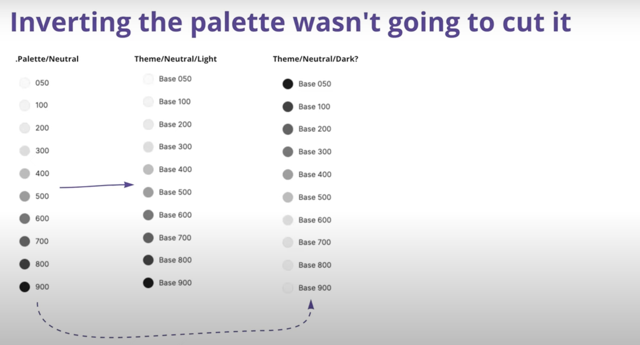
Color palette chart comparing neutral, light, and dark themes with gradient circles labeled from 050 to 900, with a purple arrow pointing to the 500 shade.
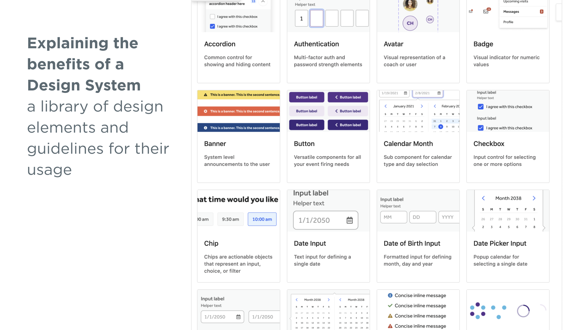
Screenshot of a design system library showcasing various UI elements such as accordions, authentication panels, avatars, badges, banners, buttons, calendars, checkboxes, date inputs, and date pickers, with descriptive labels and usage explanations.
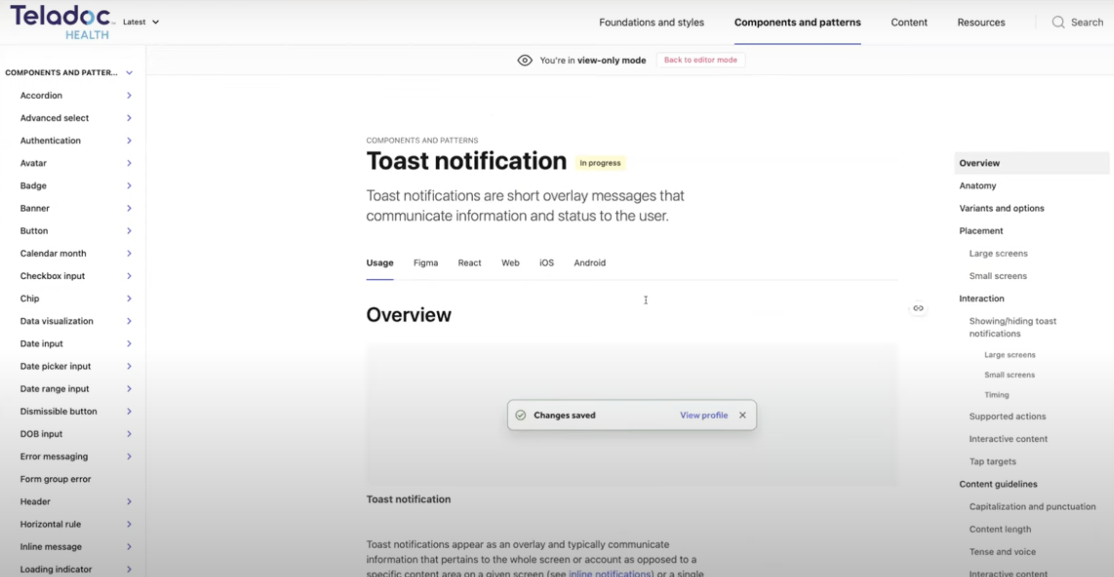
Screenshot of a web page from Teladoc Health discussing 'Toast notification' in user interface components, showing an overview of toast notifications, usage, and styling in various platforms.
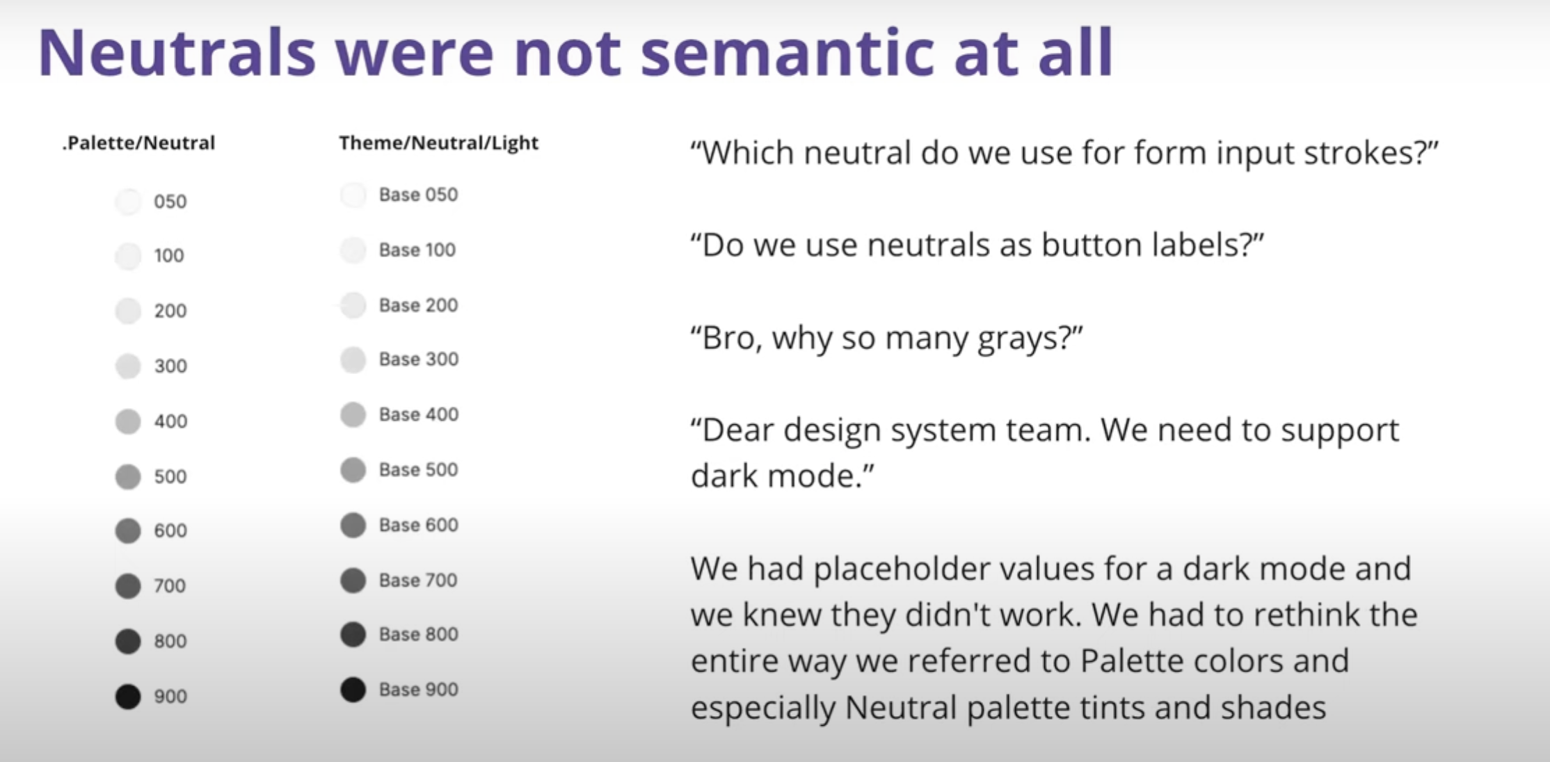
Slide titled 'Neutrals were not semantic at all' showing palette/neutral and theme/neutral/light color swatches, along with questions about neutral color usage in design and comments about dark mode support.
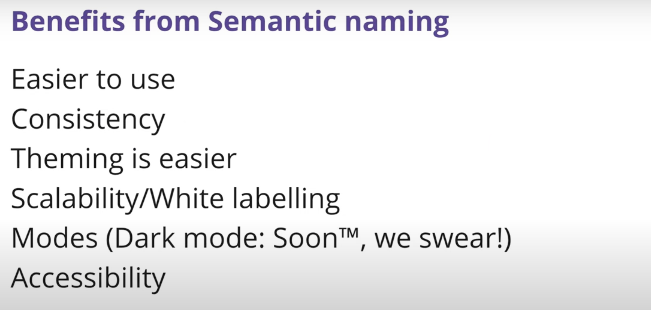
Slide titled 'Benefits from Semantic naming' listing advantages such as easier to use, consistency, easier theming, scalability/white labeling, modes, and accessibility, with some text cut off.